Arik Korotetski
All projects

FleetXpress

Fleet Management Dashboard

Optimizing fleet management with real-time insights, tracking, monitoring and analytics — enabling smarter decisions for faster and more efficient operations.

DashboardB2BLogisticsWeb AppData Viz

Client

FleetXpress

Role

Lead Product Designer

Platform

Web · Desktop dashboard

ToolsFigmaFigJamMazeNotion
Introduction

The project

FleetXpress is the operating system for modern logistics fleets. The dashboard unifies live tracking, driver profiles, route generation, shipment history, and chat support into a single, glance-able command surface — for dispatchers who need clarity, not more tabs.

01

Project goal

Give fleet operators a single, real-time command surface that turns raw location, driver, and shipment signals into fast, confident decisions.

02

The problem

01

Operators juggle several disconnected tools just to see one shipment end-to-end.

02

Legacy dashboards show data, not decisions — dispatchers still guess what to do next.

03

Route planning lives in spreadsheets and dies in translation to the driver.

04

Drivers and dispatchers work off different views, so context is lost between them.

03

The solution

01A live command dashboard where map, KPIs, and shipments stay in sync at a glance.

02A guided 3-step route creator: enter delivery info, generate the optimal route, publish it to a driver.

03Rich driver profiles so dispatchers know who they're routing before they route.

04A companion driver view that mirrors the same shipment in a calmer, mobile-first layout.

04

Research & discovery

  • Studied 4 category leaders (DHL, UPS, FedEx, Maersk) — none combined tracking, analysis, driver profiles and route generation in one place.
  • Interviewed 5 fleet operators; the recurring pain was context-switching between 3–5 tools per shift.
  • Mapped a full delivery lifecycle to find where hand-offs between dispatch and driver break down.
  • Benchmarked existing route-creation flows — most were single dense forms with no sense of progress.
FeatureFleetXpressDHLUPSFedExMaersk
Real-Time Shipment Tracking
Insights
In-depth analysis
Driver Profiles
Route Generation
Shipment History
Chat Support

Insight

FleetXpress is the only platform in the set that combines real-time tracking, in-depth analysis, driver profiles, route generation, and integrated chat support — a true all-in-one command surface where competitors cover only a slice each.

05

Personas

Marcos
Operator · ID-042
Primary persona

Marcos/ 42

Fleet Operations Manager

Fleet

60+

Tabs / shift

5

Shift

12h

Runs a mid-sized regional fleet. Started as a driver, now oversees 60+ vehicles from a control room and hates that he still needs five browser tabs to answer one question.

Transcript · 08:14

I don't need more data. I need one screen that tells me what to look at, right now.

// Objectives

  • See the whole fleet at a glance
  • Turn a delivery request into a published route in minutes
  • Keep drivers and dispatch on the same page

// Friction

  • Five separate tools to answer one question
  • Dashboards that show data but not decisions
  • Route planning that lives in spreadsheets
06

User flow

01

Start

Open the command dashboard

02

Step 2

Start a new route from the sidebar

03

Step 3

Enter delivery & contact information

04

Step 4

Generate the optimal route

05

End

Confirm details and publish to the driver
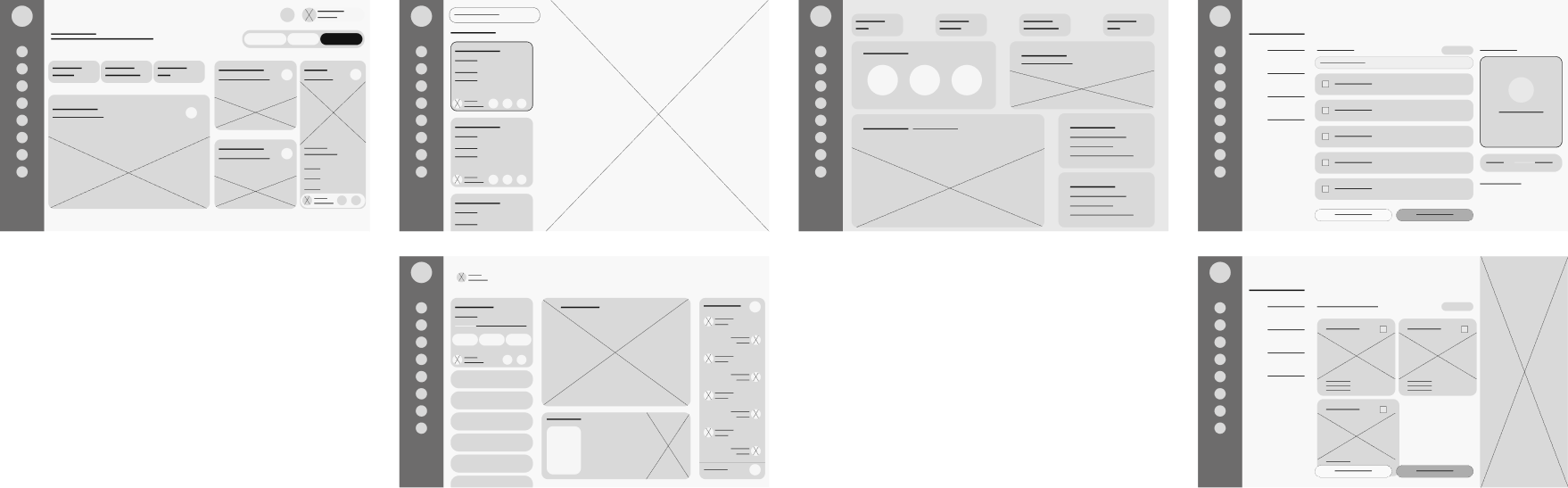
Wireframes · annotated

Decisions on the page, not just pixels

Every pin is a decision that carried from wireframe into the shipped product — so you're reading intent, not staring at a generic grey grid.

Mid-fi dashboard sheet. The pins mark structural calls — where things sit relative to each other — which is most of what a dispatcher tool gets right or wrong.
  1. One surface, not five tabs

    Active deliveries sit beside the live map rather than in a separate view — the tool replaces the map / driver app / CRM tab-hop that the job actually ran on.

  2. The map never leaves

    Route building happens next to the map instead of inside a modal, so a dispatcher never loses spatial context while editing a run.

  3. Stops are a list, not a line

    The right rail makes the route an ordered, reorderable sequence — a dispatcher thinks in stops, so the UI is built on stops.

  4. Know the driver first

    Driver profiles are a first-class screen, not a dropdown — you see who you're assigning before the run is committed to them.

Mid-fi dashboard sheet. The pins mark structural calls — where things sit relative to each other — which is most of what a dispatcher tool gets right or wrong.

07 · UI Phase

Final design

01Scene 01

Command center

a live map, KPIs, and the day's shipments in one calm surface

02Scene 02

Finances

monthly, weekly, and yearly performance in one calm overview

03Scene 03

Deliveries

every shipment, filterable and one click from action

04Scene 04

Driver profile

the person behind the shipment, in one glance

Route creation · one route, two surfaces

From dispatch desk to driver's phone

The dispatcher plans the route on the desktop dashboard. The same route lands on the driver's phone in a calmer, mobile-first view — so both sides work off exactly the same shipment, not two versions of it.

1
01 · Enter delivery info
2
02 · Add stops
3
03 · Generate route
4
04 · Review & publish
5
05 · Route dispatched
Driver
Driver receives it

What this is designed to move

Target impact

Designed intent, not measured results. Each tile is an outcome the design is built to move — the number reflects the target the flow is shaped around, not a production analytic.

5 → 1

Tools collapsed into one command surface

Dispatchers were juggling five browser tabs to answer one shipment question. The dashboard is designed to answer it on a single screen.

3 steps

From delivery request to published route

Enter · generate · publish. Route creation becomes a visible ladder instead of a dense form, so the only irreversible action stays confident.

1 shipment

Dispatcher and driver on the same view

The mobile driver screen mirrors the dispatcher's route exactly — the design targets zero context lost in the hand-off between them.

The hard part

Key decision

Split route creation into three explicit steps — enter, generate, publish — instead of one dense planning form.

What it cost

More clicks per route, and a slower path for experienced dispatchers who already know exactly what they want.

Why it was worth it

Publishing a route commits a driver's entire day, and it's the one action in the product that's expensive to undo. Testers wanted a visible moment to review the generated route before it reached a driver — the extra step bought confidence on the only irreversible action in the flow.

08 · Impact

Outcome & impact

FleetXpress is a concept project, so the numbers below come from concept validation — moderated prototype tests, task-based scenarios, and comparative benchmarks against logistics category leaders — rather than production analytics. They represent the outcomes the design is built to produce.

Lessons learned

  • A single command surface beats five specialized tools once the map and table stay in sync.
  • Route creation felt safest as a 3-step ladder: enter, generate, publish — clearly separated.
  • Driver-facing screens had to be visibly quieter than the dispatcher dashboard to build trust.
  • The board I shipped rendered every shipment with the same visual weight — a late run looked exactly like an on-time one. Status should have led the row, and ETA belonged on it; that's the first thing I'd change today.

Keep exploring