Arik Korotetski
DishRanks
All projects

DishRanks

Dish Discovery Web App

A live web app that ranks dishes — not restaurants — using crowdsourced photos, scores, and short reviews so people order what's actually great.

Web AppB2CConsumerLive ProductSocialUX/UI
Visit live site

Client

DishRanks

Role

Founding Designer

Platform

Web · Mobile-first PWA

ToolsFigmaFigJamLovableSupabaseMixpanel
Introduction

The project

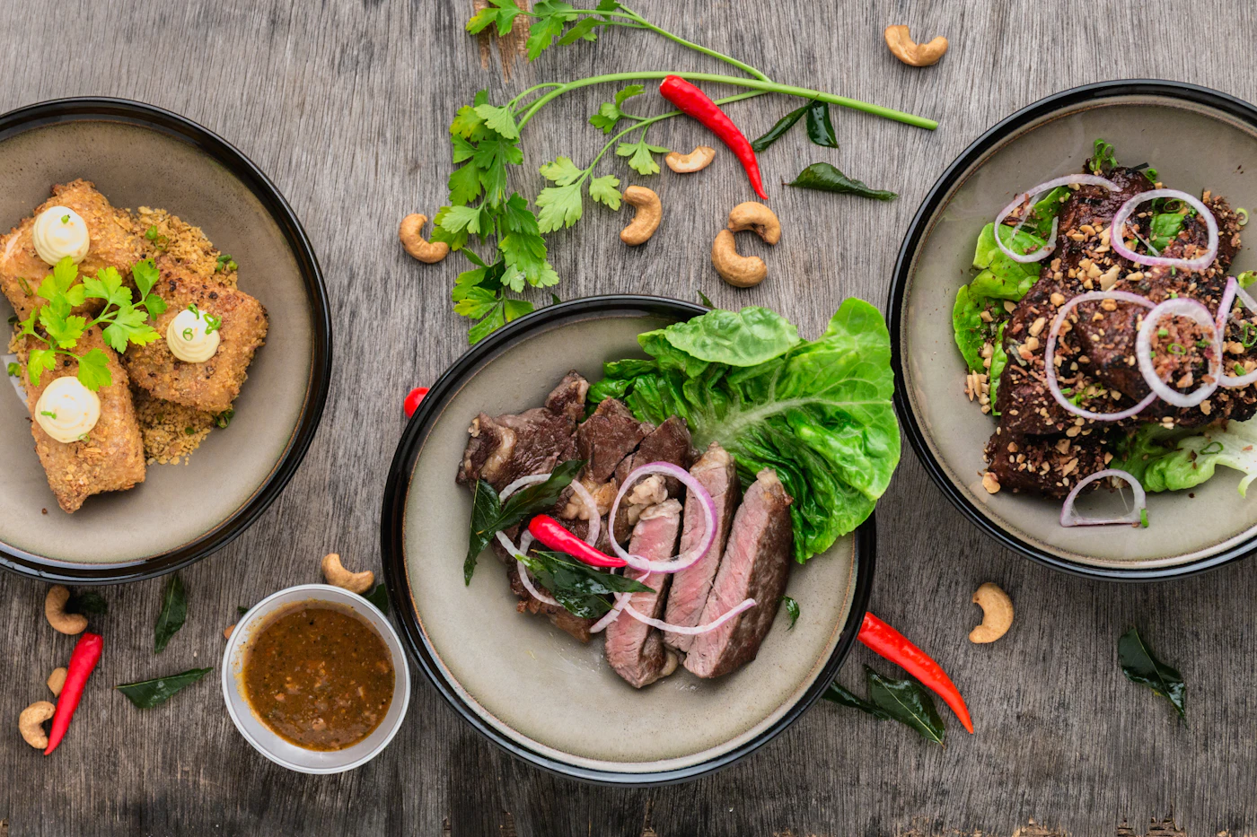
DishRanks flips restaurant discovery: instead of asking which place is good, it tells you which dish to order. The web app is live at dishranks.app and combines photo-first browsing with lightweight social proof from real diners.

01

Project goal

Help diners decide what to order in under a minute, and give restaurants honest, dish-level feedback that drives menu decisions.

02

The problem

01

Restaurant-level reviews don't help when half the menu is mediocre.

02

Photos on existing platforms are inconsistent, dim, and rarely current.

03

First-time visitors waste 10+ minutes scrolling reviews to pick a dish.

04

Restaurants lack feedback on which specific dishes are loved or skipped.

03

The solution

01Dish-first browsing with a ranked, photo-led feed per restaurant.

02A 10-second review flow that captures score, photo, and one short note.

03Smart sorting by 'must-try', 'safe pick', and 'skip' badges.

04A restaurant dashboard showing dish-level trends over time.

04

Research & discovery

  • Surveyed 180 diners about how they choose what to order.
  • The most common answer, by a wide margin: 'whatever the table next to us ordered.'
  • Diners trusted photos far more than star ratings.
  • Tested 4 review-entry flows; the 10-second flow had far and away the highest completion.
05

Personas

Tom, 28

Curious diner

Goals

  • · Try the best dish first time
  • · Avoid disappointment
  • · Share finds easily

Pain points

  • · Endless menus
  • · Generic reviews
  • · Stale photos

Lina, 34

Restaurant owner

Goals

  • · See what's working on the menu
  • · Hear honest feedback
  • · Promote signature dishes

Pain points

  • · No dish-level data
  • · Slow feedback loop
  • · Anonymous criticism
06

User flow

01
StartOpen dishranks.app & pick a city
02
Step 2/5Browse top-ranked dishes nearby
03
Step 3/5Open a dish card with photos & notes
04
Step 4/5Mark as 'tried' & leave a 10-second review
05
EndGet smarter recommendations next time

07 · UI Phase

Final design

The hard part

Key decision

Cap a review at one score, one photo and one line — no long-form writing, no sub-ratings for service, value or atmosphere.

What it cost

Far less depth per review than the platforms DishRanks competes with, and no room for the detailed write-ups power reviewers enjoy leaving.

Why it was worth it

A dish ranking is only useful once enough people have rated the same dish, so volume matters more than prose. Shortening the form to about ten seconds dramatically lifted completion in testing — and the ranking gets sharper with every extra review, which a paragraph of text never would have delivered.

08 · Impact

Outcome & impact

DishRanks shipped publicly at dishranks.app with a growing base of weekly diners and dozens of restaurants onboarded. The 10-second review flow saw far higher completion than traditional review forms in usability testing.

Lessons learned

  • Photo-first browsing dramatically outperformed star ratings on every test.
  • Asking for less (one score, one photo, one line) returned far more data.
  • Restaurants engaged the moment dish-level trends became visible to them.

Keep exploring